What is Responsive Design?
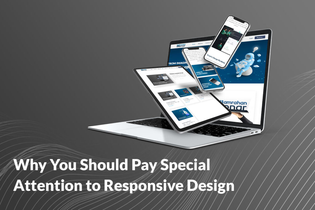
Responsive design refers to the approach of designing a website that automatically adjusts its layout and content based on the size of the user’s device. In other words, responsive design ensures that your website is displayed correctly on all devices, from smartphones to desktops. In this design, the content of the site is dynamically adjusted, so it provides the best user experience on any screen size. This includes resizing images, moving elements around the page, and changing the layout of the site. The main goal of this type of design is to provide a seamless user experience on any device.
Why is Responsive Design Important?
1. Better User Experience
One of the greatest advantages of responsive design is enhanced user experience. When users visit your site and see that the content is properly displayed on their device without the need for horizontal scrolling or zooming, it creates a positive experience. Websites without responsive design can cause issues like difficult-to-read content, the need for zooming, or missing features, leading to a negative user experience. Users prefer to visit sites that are optimized for different devices, which can result in increased time on site and a lower bounce rate.
2. Improved Page Load Speed
With responsive design, a website is automatically loaded according to the device and screen size. This means that responsive websites tend to have faster load times. This is especially crucial on mobile devices and tablets, where users expect the content to load quickly. Websites without responsive design often suffer from slower load times, which can drive users away from the site.
3. Better SEO
Google has clearly stated that responsive design is one of the key factors in search engine ranking. Websites with responsive are not only more optimized for search engines but also contribute to increased traffic and better SEO performance. In the past, many websites had separate versions for mobile and desktop, which created issues for search engines because they couldn’t easily determine whether the content on these sites was the same. Responsive design solves this problem by creating one website for all devices, allowing search engines to index content more efficiently.
4. Cost Reduction
Before the adventage of responsive design, many businesses had to designing and maintain separate versions of their website for mobile and desktop. This involved extra costs for design, development, and maintenance of two separate website versions. With responsive design, only one version of the website is created for all devices, reducing both costs and development time. Additionally, updates and changes are applied to just one version of the site, eliminating the need to make updates in two separate versions.
5. Increased Conversion Rates
Websites with responsive design generally have higher conversion rates. This is because users can easily navigate and interact with the site on any device. If your website fails to provide a good experience for mobile users, they are likely to leave and visit your competitors’ sites. This can have a significant impact on your conversion rate and sales increase.
6. Support for Multiple Devices
The use of various devices to access the internet is rapidly growing. Since most users access websites through smartphones, responsive design ensures that your site displays correctly on all devices, including mobiles, tablets, and desktops. This feature not only contributes to the user experience but also makes your site accessible to all users, regardless of the device they are using.
How to Make Your Website Responsive?
To make your website responsiveness, you need to ensure that the design of the site allows all its elements to adjust and fit the screen size of different devices. This can involve using responsive frameworks such as Bootstrap or Foundation, which automatically help in adapting the website layout for different devices. Additionally, images and videos should be optimized so that they load correctly on various devices.
Conclusion
In today’s world, where the number of different devices is increasing and users access websites from various devices, having a responsive website is a necessity for any online business. This design not only improves user experience, but also contributes to SEO, faster page load times, reduced costs, and increased conversion rates. If your website doesn’t have responsive design yet, now is the time to pay special attention to this issue and optimize your site for all devices